
Exploratory data analysis with Python
Analysing crime incidents in Los Angeles (2020–2023) using Python.
Introduction
This case study explores crime incidents in Los Angeles from 2020 to 2023 using Python in Jupyter Notebooks. The dataset, provided by the Los Angeles Police Department, contains detailed records of reported crimes. You can find the dataset here and the full Jupyter Notebook in my GitHub repository.
Data familiarization
I first examined the dataset's structure and key features in order to get a better idea of the information it contained and how this could be used to extract insights.
# examine first 10 rows of dataset
df.head(10)

# summary of dataframe
df.info()

# number of rows and columns
df.shape

# descriptive statistics
df.describe()
Data cleaning
To assess data quality, I analyzed missing values both at the dataset and column levels. Some columns, such as Weapon Used Cd and Crm Cd 2, naturally contained many null values, which was expected given the nature of the data, as not all crimes involved weapons or multiple crimes.
# create dataframe for missing values and add number of missing values by field
missing_values = pd.DataFrame(missing_values_by_column, columns=['Nr of Missing Values'])

# add column for number of rows in dataset and calculate percentage of missing values for each field
missing_values.insert(1, 'Nr of Rows', df.shape[0])
missing_values.insert(2, 'Missing Percentage', (missing_values['Nr of Missing Values']/missing_values['Nr of Rows']*100).round(4))Overall, the dataset was quite complete. However, a small number of rows (0.001 %) were missing in Crm Cd 1, which can be considered key information. Upon further inspection, I found that in these cases, the primary crime code had likely been misclassified under Crm Cd 2. To correct this, I reassigned those values to Crm Cd 1.
# fill in missing 'Crm Cd 1' values using 'Crm Cd 2' column
df['Crm Cd 1'] = df['Crm Cd 1'].fillna(df['Crm Cd 2'])
Feature engineering
To facilitate meaningful analysis, I created two new columns: Month Occ and Year Occ (month and year of occurrence), allowing for better temporal grouping.
# convert crime incident's date of occurence to datetime format
df['DATE OCC'] = pd.to_datetime(df['DATE OCC'], format='%m/%d/%Y %I:%M:%S %p', errors='coerce')

# create new columns 'Month Occ' (month crime occurred) and 'Year Occ' (year crime occured)
df['Month Occ'] = df['DATE OCC'].dt.month
df['Year Occ'] = df['DATE OCC'].dt.year
Additionally, I developed a function to categorize crimes into broader groups with the aim of simplifying data visualization. The new column was labeled Crime_Category.
# examine all crime descriptions
sorted(df['Crm Cd Desc'].unique())

# create function that categories crime incidents into broader categories based on 'Crm Cd Desc'
def categorize_crime(crime_desc):
    if any(word in crime_desc for word in ['ARSON']):
        return 'Arson'
    elif any(word in crime_desc for word in ['BURGLARY']):
        return 'Burglary'
    elif any(word in crime_desc for word in ['ROBBERY', 'PURSE SNATCHING','PICKPOCKET']):
        return 'Robbery'
    elif any(word in crime_desc for word in ['FIREARMS', 'WEAPON','SHOTS']):
        return 'Arms & weapons'
    elif any(word in crime_desc for word in ['VEHICLE', 'BIKE','BOAT']):
        return 'Vehicle theft'
    elif any(word in crime_desc for word in ['FRAUD', 'BUNCO', 'EMBEZZLEMENT', 'DOCUMENT', 'CONSPIRACY', 'COUNTERFEIT']):
        return 'Fraud & embezzlement'
    elif any(word in crime_desc for word in ['HUMAN TRAFFICKING', 'PIMPING','PANDERING']):
        return 'Human trafficking'
    elif any(word in crime_desc for word in ['HOMICIDE', 'MANSLAUGHTER']):
        return 'Homicide'
    elif any(word in crime_desc for word in ['THEFT', 'SHOPLIFTING', 'TILL TAP', 'DRUNK ROLL']):
        return 'Theft'
    elif any(word in crime_desc for word in ['KIDNAPPING', 'CHILD STEALING']):
        return 'Kidnapping'
    elif any(word in crime_desc for word in ['VANDALISM', 'TELEPHONE PROPERTY']):
        return 'Vandalism'
    elif any(word in crime_desc for word in ['EXTORTION', 'BRIBERY']):
        return 'Extortion and bribery'
    elif any(word in crime_desc for word in ['ANIMALS']):
            return 'Animal cruelty'
    elif any(word in crime_desc for word in ['TRESPASSING', 'PROWLER']):
        return 'Trespassing'
    elif any(word in crime_desc for word in ['CONTEMPT', 'VIOLATION', 'FALSE']):
        return 'Legal violations'
    elif any(word in crime_desc for word in ['THREAT', 'STALKING']):
        return 'Threats and harassment'
    elif any(word in crime_desc for word in ['BATTERY']):
        return 'Battery'
    elif any(word in crime_desc for word in ['RAPE', 'SEX', 'SEXUAL', 'SODOMY', 'LEWD', 'ORAL', 'INCEST', 'PORNOGRAPHY', 'PEEPING', 'INDECENT EXPOSURE']):
        return 'Sexual offences'
    elif any(word in crime_desc for word in ['ASSAULT', 'LYNCHING', 'RESISTING ARREST']):
        return 'Assault'
    elif any(word in crime_desc for word in ['CHILD', 'CHLD']):
        return 'Crimes against children'
    elif any(word in crime_desc for word in ['DRIVING', 'FAILURE TO YIELD']):
        return 'Traffic offences'
    elif any(word in crime_desc for word in ['DISTURBING', 'INCITING', 'DISRUPT', 'BLOCKING', 'DISPERSE']):
        return 'Public disturbance'
    else:
        return 'Other'

# apply the function to create a new column
df['Crime_Category'] = df['Crm Cd Desc'].apply(categorize_crime)
Since many crime categories had a relatively small number of occurrences, I created another grouping column, Crime_Category_Grouped, which further grouped categories consisting of less than 2% of crime incidents under 'Other'.
# count crimes per category
crime_counts = df['Crime_Category'].value_counts()

# define a threshold (categories with < 2% of total crimes)
threshold = 0.02 * crime_counts.sum()

# replace small categories with "Other"
df['Crime_Category_Grouped'] = df['Crime_Category'].apply(lambda x: x if crime_counts[x] >= threshold else 'Other')
grouped_counts = df['Crime_Category_Grouped'].value_counts()
Data visualization
Data visualization is crucial for uncovering patterns and relationships within a dataset. Various visualization techniques were used to explore the dataset.
Correlation analysis
A heatmap of correlations helped identify relationships between features. As expected, strong correlations existed between crime classification fields, confirming their interdependencies.
For example, the column Part 1-2 relates to crime classification (part I offenses include homicide, rape, aggravated assault and other more serious crimes, while part II other offenses that falloutside part I offenses), making it natural for this column to be strongly correlated to Crm Cd and Crm Cd 1.
# plot correlations using heatmap
plt.rcParams['figure.figsize'] = (18,8)
sns.heatmap(
    df.corr(numeric_only = True),
    annot=True,
    fmt='.4f',
    annot_kws={'size': 10})
plt.show()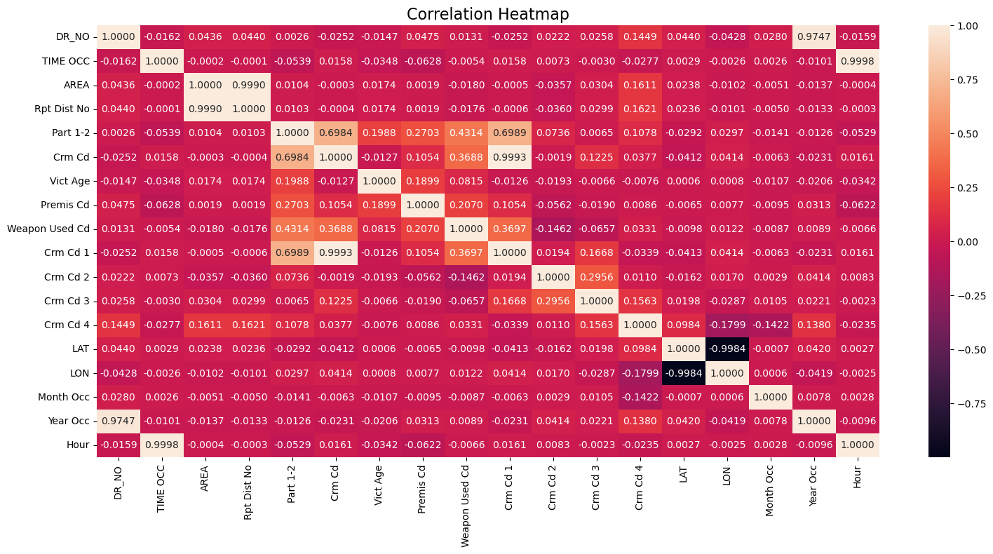
Crime trends (2020-2023)
Analysing monthly and yearly crime trends revealed a significant increase in incidents from early 2021 to early 2022, after which the trend again stabilized.
# create new column 'Year-Month' and convert year and month to datetime format
df['Year-Month'] = pd.to_datetime(df[['Year Occ', 'Month Occ']].rename(columns={'Year Occ': 'year', 'Month Occ': 'month'}).assign(day=1))

# group by this new datetime column
crime_occ_by_month = df.groupby('Year-Month').size().reset_index(name='Crime Occurences')

# convert datetime to string format YYYY-MM
crime_occ_by_month['Year-Month'] = crime_occ_by_month['Year-Month'].dt.strftime('%Y-%m')

# plot line chart based on number of crime incidents per month
plt.figure(figsize=(12, 6), dpi=100)
sns.lineplot(
    data=crime_occ_by_month,
    x='Year-Month',
    y='Crime Occurences',
    linewidth=2.5,
    color='dodgerblue')
plt.title('Crime Incidents by Month', fontsize=16)
plt.xlabel('Month', fontsize=10)
plt.ylabel('Crime Incidents', fontsize=10)
plt.xticks(crime_occ_by_month['Year-Month'], rotation=45)
plt.grid(True, linestyle='-')
plt.tight_layout()
plt.show()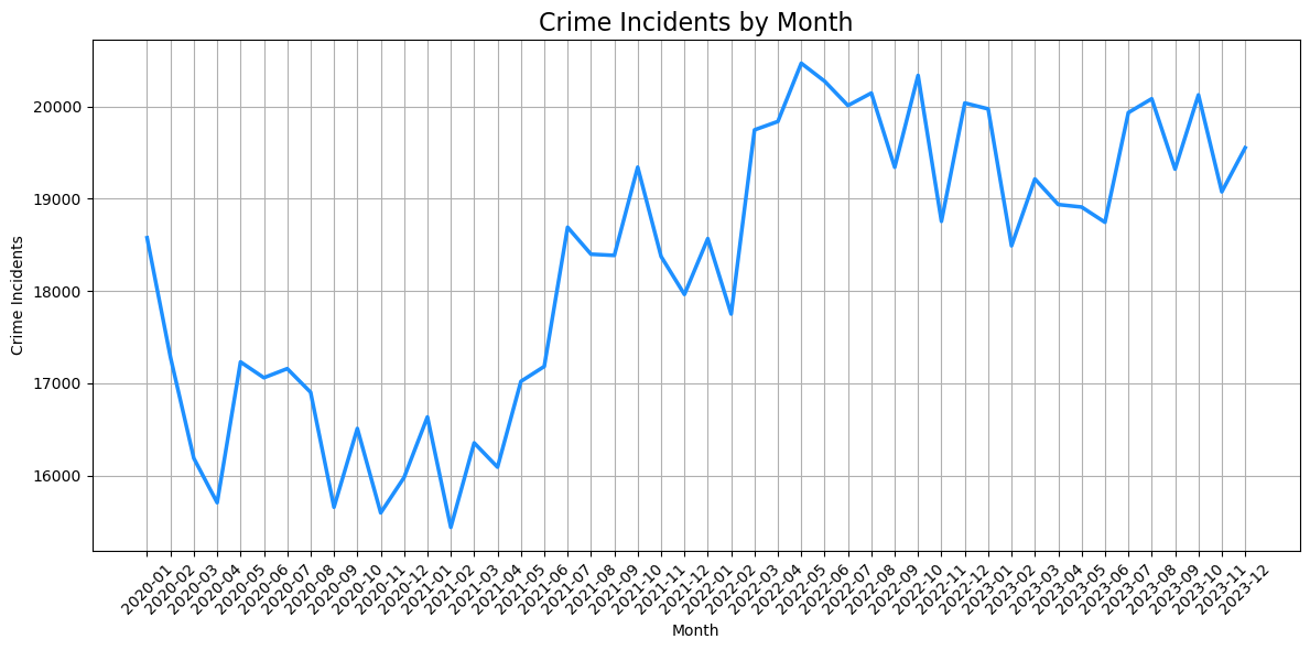
# group by new datetime column
crime_occ_by_year = df.groupby('Year Occ').size().reset_index(name='Crime Occurences')

# plot line chart based on number of crime incidents per month
plt.figure(figsize=(12, 6), dpi=100)
sns.lineplot(
    data=crime_occ_by_year,
    x='Year Occ',
    y='Crime Occurences',
    linewidth=2.5,
    color='dodgerblue')
plt.title('Crime Incidents by Year', fontsize=16)
plt.xlabel('Year', fontsize=10)
plt.ylabel('Crime Incidents', fontsize=10)
plt.xticks(crime_occ_by_year['Year Occ'])
plt.ylim(0, crime_occ_by_year['Crime Occurences'].max() * 1.1)
plt.grid(True, linestyle='-')
plt.tight_layout()
plt.show()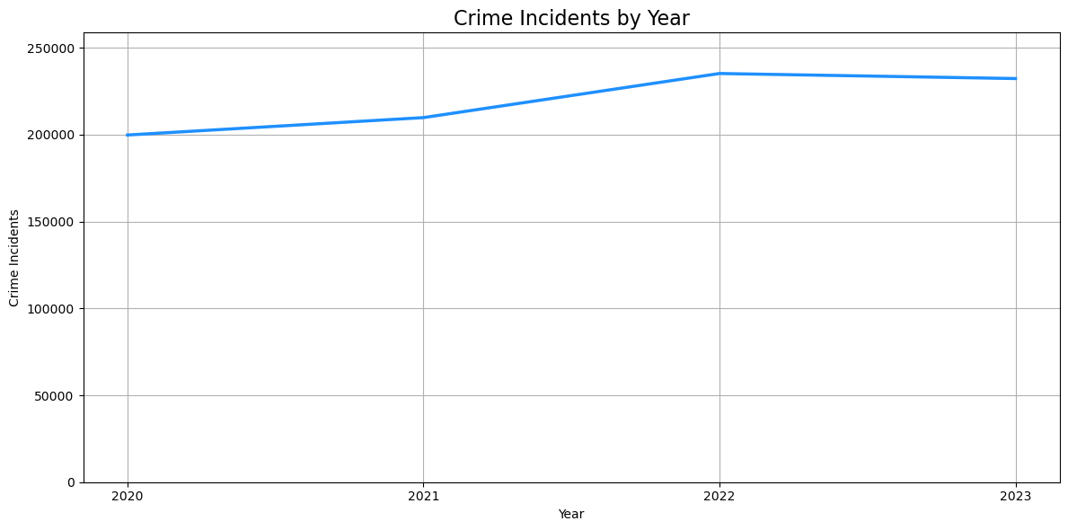
While there is not a major change in most crime categories year by year, a notable rise in thefts and vehicle thefts accounted for a majority of the increase in crime from 2021 to 2022.
# convert year to numeric
df['Year Occ'] = pd.to_numeric(df['Year Occ'], errors='coerce')

# group data by year and crime category
crime_trend = df.groupby(['Year Occ', 'Crime_Category']).size().reset_index(name='Crime Occurrences')

# plot line chart based on number of crime incidents by category and year
plt.figure(figsize=(12, 6), dpi=100)
sns.lineplot(
    data=crime_trend,
    x='Year Occ',
    y='Crime Occurrences',
    hue='Crime_Category',
    marker='o',
    linewidth=2
)
plt.title('Crime Incidents by Category and Year', fontsize=16)
plt.xlabel('Year', fontsize=10)
plt.ylabel('Crime Incidents', fontsize=10)
plt.xticks([2020, 2021, 2022, 2023], fontsize=10)
plt.grid(True, linestyle='--', alpha=0.7)
plt.legend(title="Crime Category", bbox_to_anchor=(1.05, 1), loc="upper left")
plt.show()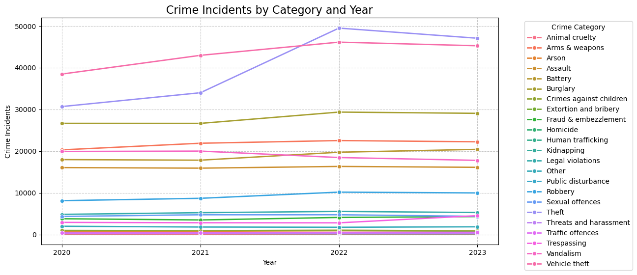
Crime by category
During the period 2020-2023, theft-related crimes dominated the dataset. Visualizing crime categories confirmed that theft, vehicle theft and burglary comprised the majority of recorded incidents.
# plot crime incidents by cateogry in descending order
plt.figure(figsize=(12, 6), dpi=100)

num_categories = df['Crime_Category'].nunique()
palette = sns.color_palette("crest", num_categories)[::-1]
sns.countplot(
    data=df,
    x='Crime_Category',
    order=df['Crime_Category'].value_counts().index,
    hue='Crime_Category',
    palette=palette)
plt.title('Crime Incidents by Category (2020-2023)', fontsize=16)
plt.xticks(rotation=90)
plt.xlabel('Crime Category', fontsize=10)
plt.ylabel('Crime Incidents', fontsize=10)
plt.tight_layout()
plt.show()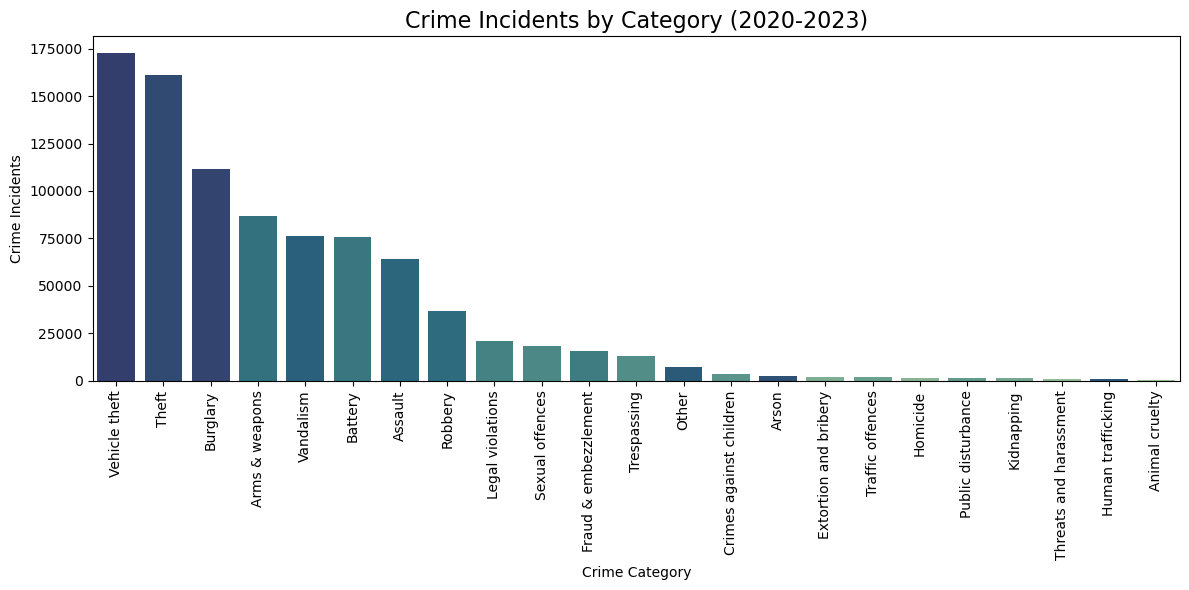
In the treemap, smaller categories accounting for less than 2 % of total crimes were grouped under 'Other' for clarity.
# plot treemap based on crime categories
fig, ax = plt.subplots(figsize=(12, 6), dpi=100)
width, height = 10, 6
normed_sizes = sq.normalize_sizes(grouped_counts, width, height)
rects = sq.squarify(normed_sizes, 0, 0, width, height)
colors = reversed(sns.color_palette("crest", len(grouped_counts)))
for rect, color, label in zip(rects, colors, grouped_counts.index):
    ax.add_patch(
        plt.Rectangle(
            (rect['x'], rect['y']), rect['dx'], rect['dy'],
            facecolor=color, edgecolor='white', linewidth=2
        )
    )
    ax.text(
        rect['x'] + rect['dx'] / 2, rect['y'] + rect['dy'] / 2,
        label, ha='center', va='center', fontsize=8, color='white'
    )
ax.set_xlim(0, width)
ax.set_ylim(0, height)
ax.set_xticks([])
ax.set_yticks([])
ax.set_frame_on(False)
plt.title("Crime Incidents by Category (2020-2023)", fontsize=16)
plt.show()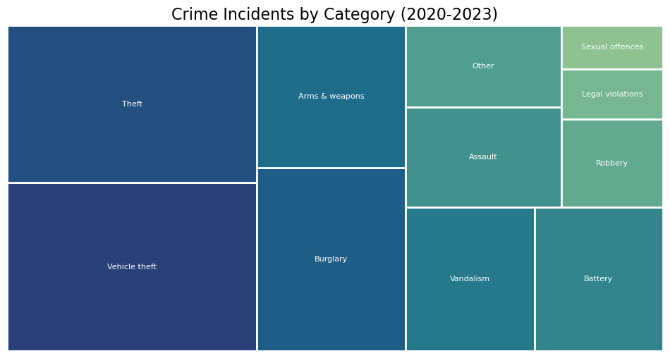
Crime by area
Certain areas, such as Central and 77th Street, consistently reported higher crime rates. Notably, crime incidents in the Central area increased significantly in 2022 and 2023, largely due to an increase in thefts and burglaries.
# group data by area
crime_occ_by_area = (
    df.groupby('AREA NAME')
      .size()
      .reset_index(name='Crime Occurrences')
)

# sort in descending order
crime_occ_by_area = crime_occ_by_area.sort_values(by='Crime Occurrences', ascending=False)

# plot a single bar chart based on area
plt.figure(figsize=(12, 6), dpi=100)
sns.barplot(
    data=crime_occ_by_area,
    x='AREA NAME',
    y='Crime Occurrences',
    hue='AREA NAME',
    palette='tab20',
    edgecolor='white',
    legend=False
)
plt.title('Crime Incidents by Area (2020-2023)', fontsize=16)
plt.xlabel('Area', fontsize=10)
plt.ylabel('Crime Incidents', fontsize=10)
plt.xticks(rotation=45)
plt.grid(axis='y', linestyle='--', alpha=0.7)
plt.tight_layout()
plt.show()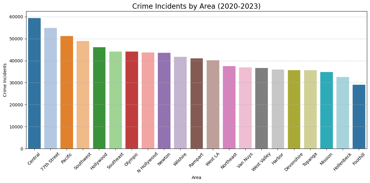
# create pivot table
pivot_df = df.groupby(["Year Occ", "AREA NAME", "Crime_Category_Grouped"]).size().unstack(fill_value=0)

# plot figure
plt.figure(figsize=(16, 6), dpi=100)

# extract unique year-area labels
original_labels = pivot_df.index.get_level_values('Year Occ').astype(str) + " - " + pivot_df.index.get_level_values('AREA NAME')

# identify year transitions and prepare labels
new_x_labels = []
year_positions = {}  # store positions for year labels

# ensure 2020 is explicitly stored
first_year = original_labels[0].split(" - ")[0]
year_positions[first_year] = 0  # mark 2020's position

for i, label in enumerate(original_labels):
    year, area = label.split(" - ")

    # insert blank space at year transitions
    if i > 0:
        prev_year = original_labels[i - 1].split(" - ")[0]
        if prev_year != year:
            new_x_labels.append("")  # insert empty space
            year_positions[year] = len(new_x_labels)

    # add space after area name (using non-breaking spaces)
    new_x_labels.append(area + '\u00A0' * 5)

# convert categorical labels into numerical x-ticks
x_positions = np.arange(len(new_x_labels))

# initialize bottom stack
bottom = np.zeros(len(x_positions))

# assign colors based on crime categories
colors = plt.cm.Set2.colors

# loop through each crime category and plot the bars stacked
for i, crime_category in enumerate(pivot_df.columns):
    # add zeroes in blank space positions to maintain alignment
    y_values = np.insert(pivot_df[crime_category].values,
                         [i for i in range(1, len(original_labels)) if original_labels[i].split(" - ")[0] != original_labels[i - 1].split(" - ")[0]],
                         0)
    plt.bar(
        x_positions,
        y_values,
        bottom=bottom,
        label=crime_category,
        color=colors[i % len(colors)]
    )
    bottom += y_values

# set x-ticks for area names with extra spacing
plt.xticks(x_positions, new_x_labels, rotation=90, ha='right')

# add year labels separately at the identified positions, moving them lower
for year, pos in year_positions.items():
    plt.text(pos, -max(bottom) * 0.08, year, ha='center', fontsize=12, fontweight='bold', color='black')

# set titles and labels
plt.title('Number of Crimes by Area, Year and Category', fontsize=16)
plt.xlabel('Year - Area', fontsize=10)
plt.ylabel('Crime Occurrences', fontsize=10)
plt.grid(axis='y', linestyle='--', alpha=0.7)
plt.legend(title='Crime Category', bbox_to_anchor=(1.05, 1), loc='upper left')
plt.tight_layout()
plt.show()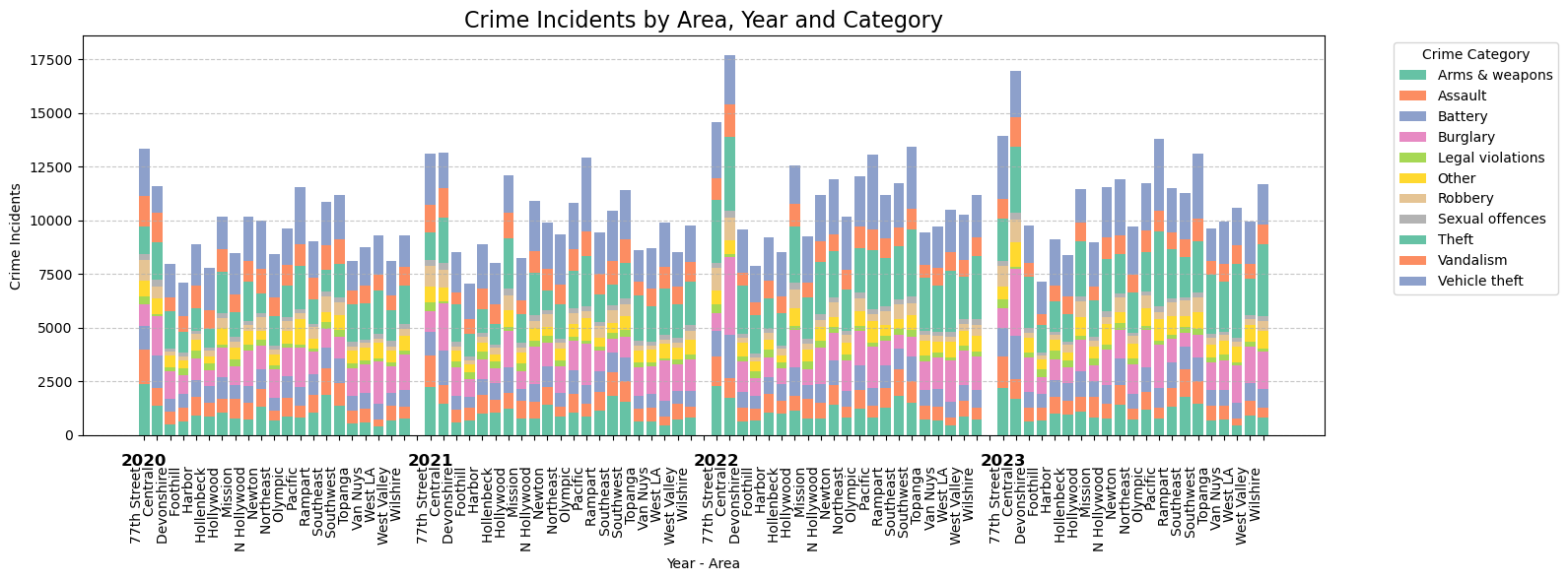
Crime by time of occurence
A histogram of crime occurrences by time revealed distinct peak hours. Around mid-day, between 11:00 and 12:00, there is a sharp increase, that is mainly due to thefts. Another significant peak can be detected at midnight, where thefts remained the predominant crime.
From the afternoon until early evening there is a steady increase in crimes, which then starts to drop again around 19:00. Vehicle thefts increase in the evening hours, while regular theft is showing the opposite trend.
# convert TIME OCC from HHMM format to hours (e.g., 1530 → 15.5)
df["Hour"] = df["TIME OCC"] // 100 + (df["TIME OCC"] % 100) / 60

# plot histogram based on number of crime occurences and time of occurence
plt.figure(figsize=(10, 5), dpi=100)
sns.histplot(
    df["Hour"],
    bins=24,
    kde=True,
    color="c")
plt.xlabel("Hour of the Day", fontsize=10)
plt.ylabel("Crime Incidents", fontsize=10)
plt.title("Crime Incidents by Time of Day", fontsize=16)
plt.xticks(range(0, 24))
plt.grid(axis='y', linestyle='--', alpha=0.7)
plt.show()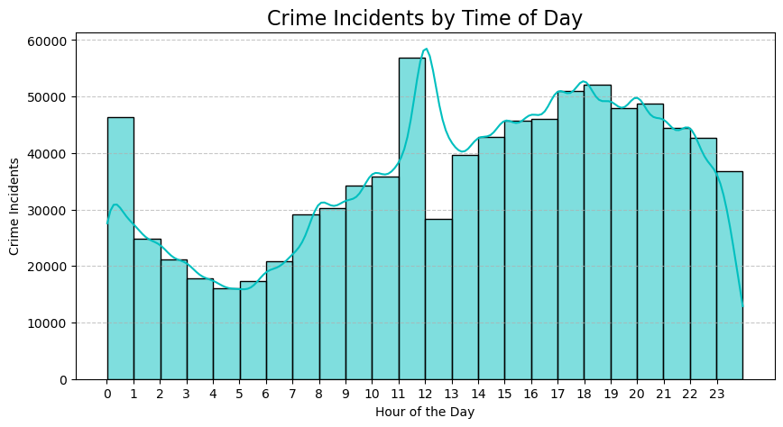
# plot histogram based on number of crime occurences and time of occurence split by crime categories
plt.figure(figsize=(12, 6), dpi=100)
ax = sns.histplot(
    df, x="Hour",
    hue="Crime_Category_Grouped",
    bins=24,
    kde=True,
    multiple="stack")
plt.xlabel("Hour of the Day", fontsize=10)
plt.ylabel("Crime Incidents", fontsize=10)
plt.title("Crime Incidents by Category and Time of Day", fontsize=16)
plt.xticks(range(0, 24))
plt.grid(axis='y', linestyle='--', alpha=0.7)
if ax.legend_:
    ax.legend_.set_bbox_to_anchor((1.05, 1))
    ax.legend_.set_title("Crime Category")
plt.show()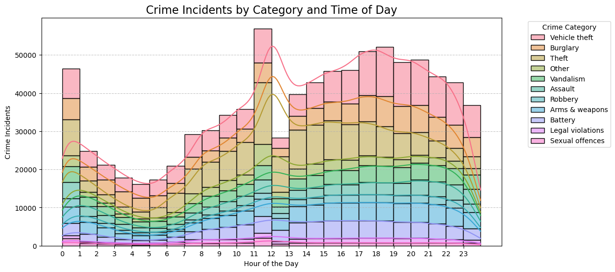
Conclusion
This exploratory data analysis provided insights into crime trends, patterns, and distributions in Los Angeles from 2020 to 2023. Key findings include:
- A sharp rise in crime incidents between 2021 and 2022.
- Theft and vehicle theft as the most prevalent crimes.
- Certain areas, such as Central, exhibiting higher crime rates.
- Distinct peak hours for crime incidents.
Further analysis could explore causal factors behind these trends, such as socioeconomic conditions, policy changes, or external events.
For the full implementation, please visit my GitHub repository.

Get in touch
I’m excited to explore new opportunities and challenges.